Friday, August 30, 2019

Zine Updates part II

Hello friends!

A couple weeks ago Emmy and I got together and discussed the zine project. We can all agree that we need to get moving on this project, so here are some things that we decided:

  • We need to simplify. So, we are doing eight pages instead of a sixteen page zine. Thumbnails for this eight page layout can be found in this folder: M:\DESIGNER\~multimedia services\MULTISERV PROJECTS\Illustration Showcase Zine. Look for the files named "8PageBrainstorm" and "8 pages thumbnails" for an idea of what we were thinking. 
  • Quick run-through of the eight page layout: 
    1. front cover/title
    2. intro to the artists of 329/describing the setting. This will be narrative illustration.
    3. Map 
    4. three spot illustrations
    5. three more spot illustrations, so six total
    6. t-shirt designs
    7. graph/other things we can do/other abilities
    8. back cover/contact info
  • For our story: we are going to use speech bubbles to narrate the story. An artists of 329 takes the reader through different styles of art, explaining things along the way. At the end, the character mentions that we can also do other artistic things like a, b, c, etc. (this is page seven). 
  • For the spot illustrations: We want to show our stuff!! Here are some different styles for the spot illustrations, so the reader can see how diverse our skills are ;) (If you don't know what I'm talking about, see the file "8PageBrainstorm")
    • flat color, limited palette, emphasis on line work
    • stylized, cell shading, shape based. (maybe do a spot showing motion, this style is suited for that I think. Think sports, dance, etc)
    • traditional realism (like a realistic oil painting). In a course, this might be like a historical figure portrait or something.
    • art with more abstract elements, kind of like what you would see in an editorial piece
    • realistic, but still somewhat stylized. Painterly, texture, has some shading
    • no line work, tasteful texture, flat color, shape based. Maybe you'd see this on a website or on a t-shirt. I think science, the STEM careers. 
    • a tasteful pattern w a nice color palette. Something you would see in a banner
    • any of these styles can be used to do like a narrative vignette. That's always an idea.
    • If you have any better ideas for styles, please throw out your ideas! Our goal for the spot illustrations is to show a good range of style and skill.
  • IN CONCLUSION this is what we need: 1 character design for the narrator/artist, 1 page where we put that character in a narrative scene (intro page 2), 1 really nice map, 6 spot illustrations, a couple t-shirt designs,  and 1 cover design. Sound gewd? Oh and we need to decide on a color palette.
  • If you have any other input, PLEASE ADD TO THIS OR COMMENT. Thanks!!!

Wednesday, July 10, 2019

Zine Updates

ZINE UPDATES


WE NEED TO COME UP WITH A STORY! 

Zines are like stories and less like catalogs! So we need to come up with a story about 329. 

Notes from Suzy:
  • Make it relatable to people who are looking for a more professional look
  • Keep the story more on the realistic side
  • Find creative ways to advertise our products! (is the character wearing a t-shirt that we designed? How are the ideas presented? etc.) 
  • We need to define vocabulary! (what does narrative illustration mean? etc.) 
Parameters: 
  • 12-16 pages
  • Full Color

So if you have any story ideas, please post them here so we can talk about them with our next meeting! 

Story Ideas: 

Wednesday, May 1, 2019

WE ARE MAKING MAILERS!

Hey there Illustrators!

So Suzy presented the idea that we make a Mailer to promote our Illustration Team to the rest of the staff here at Continuing Education. 

So it's up to us to start making some proposals to give to Suzy! 

We have been given suggestions (which are in our room on giant sticky notes), but we have free range to come up with something awesome. Write down ideas you have on the sticky note! 

We threw around the idea of a zine! It would be easy to print and our artwork wouldn't be crunched down onto one piece of paper. (It will also make people less inclined to see it as a regular flyer and throw it away)

Network folder for this project is in M:/isdata2/designer/~multimedia services/multiserv projects/illustration showcase zine.


So here are some tips while we brainstorm: 

1. We Need a Theme

Many mailers that illustrators use have a cohesive theme. Now this isn't necessarily a theme like EFY. It's more focused on Design Aspects like:
  • Color
  • Pattern
  • Framing
  • Font
Check out this link to CreativeBloq for some of these ideas: 

or this one: 


2. We Need Artwork
We need to come up with some illustrations to promote us on the mailer. They will be front and center! This is anything from Maps, Graphics, Narratives, Concept Art, Character Design and even Graphic Novel examples (which we have done in the past). Artwork ideas should be passed off with the team and with Suzy. 


**We talked about how the idea of zines can be a bit tricky because many employees here want to see more of this: 


and less of this: 


While we may understand that many illustrations that look cartoony and seem a little rough is considered a professional art style, many people won't know that. So we need to design this in a way that is professional, but still stays true to our work. 


Here are some events coming up (in order by date) that our work can cater to: 

Conferences: 

  • AFY (June 3rd --also on later dates (check conference link below) 
  • French Camp (June 10th) 
  • Teachers Camp (June 10th) 
  • Design Week (June 17th) 
  • Twisted Tales and Evil Villians (Writing Camp) (June 24th) 
  • Young Authors Academy (July 8th) 
  • and more found here: https://calendar.byu.edu/categories/conferences
Education: 

Hope this all helps guys! Good luck! 


Wednesday, January 16, 2019

How to Make a Graph in Adobe Illustrator: Extra Graphs in Illustrator

Hey IS Artists!

Here I am going to give you a brief tutorial of which graph is which with point graphs, line graphs, radial graphs, stacked graphs, scatter plots, and bar graphs. It's important to know which graph our clients are wanting and how to plug in the data for them.

Luckily, like the Column Graph and the Pie Chart, all of these charts work the same. It's all about what numbers you plug in. (If you want a detailed explanation of how to make a graph refer to the Part 1 of this tutorial).

Stacked Graph

A stacked graph shows the height of the column and how it corresponds to the amount being compared. For stacked column graphs, numbers must be all positive or all negative.

Stacked column graph data
Like shapes, you can select each individual box and change it's color, effect, and even give it a 3D look. Refer to the Pie Chart Tutorial for how to make something 3D.

Make sure you use the first column in the data window to put what you want on your "x-axis" (ex. 2014, 2015, dogs, etc.)

Bar Graph

The length of the bar corresponds to the amount being compared. You can combine positive and negative values. Negative values appear as columns extending below the horizontal axis.
Bar graph data
Again, you can change the colors, gradients, and volume of the shapes in the graph just by using the direct selection tool and clicking on the bars.

Line Graph

Each column of data corresponds to one line in the line graph. You can combine positive and negative values in a line graph.

Line graph data

LEGENDS
**If you want to create a legend or key for your graph leave the top left corner cell blank and then
just put the information of the key on the top row of the data chart. 

Labels in Graph Data window
A. Data set labels B. Blank cell C. Category labels 

Area Graph
Values must be all positive or all negative. Each row of data entered corresponds to a filled area on the area graph. Area graphs add each column’s values to the previous column’s totals. Therefore, even if area graphs and line graphs contain the same data, they appear substantially different.

Area graph data

Scatter Graph
A scatter graph differs from the other kinds of graphs in that both axes measure values; there are no categories.
  • Enter dataset labels in every other cell along the top row of the worksheet, starting with the first cell. These labels will appear in the legend.
  • Enter yaxis data in the first column and xaxis data in the second column.
Note: Disable the option Connect Data Points to remove connecting lines.

Scatter graph data
Note: Scatter Graphs cannot be mixed with other graphs. 

Radar Graph
Each number is plotted on an axis and connected to the others in the same axis to create a “web.” You can combine positive and negative values in a radar graph.
Radar graph data

(c) Adobe Info

How to Make Graphs in Adobe Illustrator Part 2: Pie Charts

Hey IS Artists! 

Here is a tutorial on how to make graphs in Illustrator just by inputting data. It'll save you tons of time not having to create point by point vector pie-charts, column graphs, etc. 


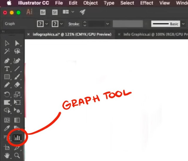
Where is the Graph Tool? 

The graph tool in Illustrator is in the right-hand column of your tool set. It may look like a small column graph if you haven't used another graph tool before. 


You can bring a palette of all of your graph tools by clicking on the tool and then clicking the side bar of the window that tool brings up. But you don't have to. It's just like any other! 


Pie Charts


Similar to the column charts, select the Pie Chart tool from the Graph Tool options. 
Then click and drag where you want the chart to be/how much room you want it to take up on your artboard. 

The little excel-data window will pop up and you can enter in your data manually. The top row is where you put what your pie chart is representing (ex. Macbooks, iPods, dogs, etc.) This will also create your Legend for the Pie Chart. 

The next row will be where your numbers go in. Remember you can import your data by clicking the icon next to your data input bar. 


You can also change the font of the words by the legend by selecting the words and going up to the font drop-down menu. 


Like shapes, each piece of the chart is like a shape (even though the whole chart is grouped together). Select the piece of the chart you want and you can then change the color. 
**You have to change the legend swatch independent of the pie piece. 


Ring Pie Chart

If you are trying to make a ring pie chart here are the steps you should follow: 

Step 1: You have to ungroup the pie chart. 
***This will make changing the data no longer possible! Do so with certainty that your data is accurate! 
-Select the whole graph
-Go to Object from the to menu
-Select "Ungroup"

**Don't hit Expand!! Even though it's a common method, don't use it for this. 


This will bring up a dialogue box letting you know about the data. Hit yes and now you're ready to move on! 


Step 2: Make a circle shape in the middle of the pie chart. 
-Get your ellipse tool and draw a circle in the middle of your chart. 

PRO TIP: Hold down Shift + Alt key to make a perfectly symmetrical circle in the middle of your pie chart.

Step 3: Select your graph again. Go to your Shape Builder tool and use it to cut out the shape by drawing a circle inside of the ellipse. 

PRO TIP: HOLD DOWN THE ALT KEY TO CUT OUT THE SHAPE!

It will cut the shape out automatically following the ellipse shape you created. 
**Avoid just putting an ellipse shape over the graph and then filling it to match the background. It's important to cut out the shape for future edits (3D, etc.) 


3D Pie-Chart

Your pie chart doesn't need a ring in it to become 3D but we are going to continue using the example above for this next tutorial on how to make your chart 3D. 

Step 1: REGROUP your graph. 
-Select it
-Use the hotkey marked in the image below. Or use the drop-down menu. 


Step 2: Make your 3D Shape
-Go up to Effect from the drop-down menu up at the top of your screen
-Go down to 3D
-Click "Extrude and Bevel"


Your shape is now 3D and you can mess around with the direction and the light-source with the cube in the window that just popped up. 

If you want to do more with your light-source then click the "More Options" Button at the bottom of the window. It'll bring up a sphere with a light source. You can also change the ambient lighting, the intensity and the shading color in the drop down menus next to the light source sphere. 

You can also change the shadow plane of the new 3D object by changing it on the "Shade Color" Drop-down menu. It can be "None" "Black" or "Custom" where you choose the color you want the shadow plane to be. 

**Make sure to check your colors that they fit with the new light-source of the graph. (You want to be able to see the planes) 

**Make sure your "preview" box is check on so you can see your shape change in real-time. 


Moving Pieces of your Pie Chart

If you want to move pieces of your pie chart then turn off the 3D effect on your graph (do this by clicking the visibility marker or the eye next to the layer that says "3D". This will make your graph appear flat again. 

Then take the individual pieces you want to move and move them. 

Now turn your 3D effect back on and voila! Your pie chart looks even cooler! 


You now know how to make a pie chart! 


How to Make Graphs in Adobe Illustrator Part 1: Column Graphs

Hey IS Artists! 

Here is a tutorial on how to make graphs in Illustrator just by inputting data. It'll save you tons of time not having to create point by point vector pie-charts, column graphs, etc. 


Where is the Graph Tool? 

The graph tool in Illustrator is in the right-hand column of your tool set. It may look like a small column graph if you haven't used another graph tool before. 


You can bring a palette of all of your graph tools by clicking on the tool and then clicking the side bar of the window that tool brings up. But you don't have to. It's just like any other! 


Column Graphs

Here is a tutorial of how to make a column graph by entering in data. 

Step 1: 
Select the column tool from your graph tool set. Now click and drag onto your artboard where you want the column to be. 

Step 2: 
Once you have a graph up a small "excel-like" window will automatically pop up. Here is where you can manually enter in the data. 


Enter in your data into the first row of the chart. The graph will automatically change as you put in the numbers. There! You're done making a graph! Simple right? 

Comparison Column Graphs

To make a comparison chart simply just plug the second set of data into the second row of the chart. The chart will then appear on the right of your original chart. 


If you need to IMPORT your data, click on the icon that is directly next to where you enter in your numbers. 
**Make sure you data is in the right file format (.txt, etc.) 


  • If you accidentally enter graph data backward (that is, in rows instead of columns, or vice versa), click the Transpose button () to switch the columns and rows of data.

Adding Color

Now, if you want to give your chart some flare, just treat it like a normal shape! Each box is going to act like an individual shape. Use your select or Direct Select tool to highlight one of the columns and simply use a swatch to change the color. 
**Changing a color on one graph will not change the color in the other graph! 

You can also remove or edit the outline of the columns as well. 


Changing Fonts

You can also change the font of the numbers beside your chart. Select the numbers and change the font to what you want up at the top. 


If you want to add more flare you can add effects like you would to any shape like Graphic Styles which can be found on the right of your workshop. Choose an effect and apply it to one or all of your shapes. 


If you want to change the colors of the other Graphic Styled shapes, click the "Recolor" button at the top of your screen. This will bring up a window with all of the levels of your colors on your graph. Hit the "Edit" Button and a color disc will appear. 
CLICK THE LINK BUTTON at the bottom right of the color disc and then you can change the colors by clicking and dragging the arm on the disc. Do this for each individual column. 


If you need to change some data, don't worry, you don't have to start over. Simply right click the chart and select "Data". BOOM! You now have your excel box back and you can change any of the data below. Your graph will automatically adjust even if the numbers are higher than they originally were. Your graph will compensate. Your colors and font will stay the same as well!


That's how you make a Column Graph! 

Wednesday, September 26, 2018

Splash Banner Quality

Hello pals! If you're getting frustrated with professors or designers asking you to create unrealistically rendered and refined splash banners or content images in an insanely small amount of time, feel free to use this PDF (It's chilling in the N: drive under this filepath name: N:\IS\Production\Courses\(MMS-Splash Banner Quality Guide) ) to politely remind them that we are not, in fact, magicians.

I've broken it into a 5 hr category, 10 hr category, and a 12-18 hr category to show those who aren't familiar with the artistic process that the amount of quality of the final product is directly related to how much time we are able to spend illustrating them.

Good luck, homies.
-Amelia G