Here is a tutorial on how to make graphs in Illustrator just by inputting data. It'll save you tons of time not having to create point by point vector pie-charts, column graphs, etc.
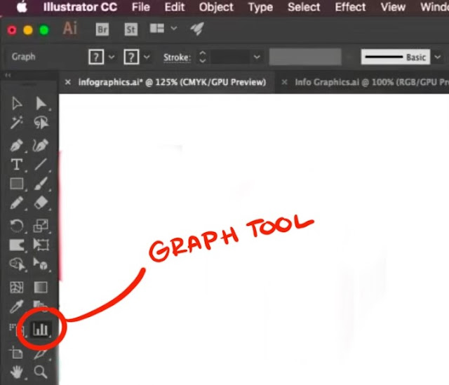
Where is the Graph Tool?
The graph tool in Illustrator is in the right-hand column of your tool set. It may look like a small column graph if you haven't used another graph tool before.

You can bring a palette of all of your graph tools by clicking on the tool and then clicking the side bar of the window that tool brings up. But you don't have to. It's just like any other!
Column Graphs
Here is a tutorial of how to make a column graph by entering in data.
Step 1:
Select the column tool from your graph tool set. Now click and drag onto your artboard where you want the column to be.
Step 2:
Once you have a graph up a small "excel-like" window will automatically pop up. Here is where you can manually enter in the data.

Enter in your data into the first row of the chart. The graph will automatically change as you put in the numbers. There! You're done making a graph! Simple right?
Comparison Column Graphs
To make a comparison chart simply just plug the second set of data into the second row of the chart. The chart will then appear on the right of your original chart.

If you need to IMPORT your data, click on the icon that is directly next to where you enter in your numbers.
**Make sure you data is in the right file format (.txt, etc.)

- If you accidentally enter graph data backward (that is, in rows instead of columns, or vice versa), click the Transpose button (
 ) to switch the columns and rows of data.
Adding Color
Now, if you want to give your chart some flare, just treat it like a normal shape! Each box is going to act like an individual shape. Use your select or Direct Select tool to highlight one of the columns and simply use a swatch to change the color.
**Changing a color on one graph will not change the color in the other graph!
You can also remove or edit the outline of the columns as well.

Changing Fonts
You can also change the font of the numbers beside your chart. Select the numbers and change the font to what you want up at the top.

If you want to add more flare you can add effects like you would to any shape like Graphic Styles which can be found on the right of your workshop. Choose an effect and apply it to one or all of your shapes.

If you want to change the colors of the other Graphic Styled shapes, click the "Recolor" button at the top of your screen. This will bring up a window with all of the levels of your colors on your graph. Hit the "Edit" Button and a color disc will appear.
CLICK THE LINK BUTTON at the bottom right of the color disc and then you can change the colors by clicking and dragging the arm on the disc. Do this for each individual column.

If you need to change some data, don't worry, you don't have to start over. Simply right click the chart and select "Data". BOOM! You now have your excel box back and you can change any of the data below. Your graph will automatically adjust even if the numbers are higher than they originally were. Your graph will compensate. Your colors and font will stay the same as well!

That's how you make a Column Graph!
No comments:
Post a Comment