Wednesday, January 16, 2019

How to Make a Graph in Adobe Illustrator: Extra Graphs in Illustrator

Hey IS Artists!

Here I am going to give you a brief tutorial of which graph is which with point graphs, line graphs, radial graphs, stacked graphs, scatter plots, and bar graphs. It's important to know which graph our clients are wanting and how to plug in the data for them.

Luckily, like the Column Graph and the Pie Chart, all of these charts work the same. It's all about what numbers you plug in. (If you want a detailed explanation of how to make a graph refer to the Part 1 of this tutorial).

Stacked Graph

A stacked graph shows the height of the column and how it corresponds to the amount being compared. For stacked column graphs, numbers must be all positive or all negative.

Stacked column graph data
Like shapes, you can select each individual box and change it's color, effect, and even give it a 3D look. Refer to the Pie Chart Tutorial for how to make something 3D.

Make sure you use the first column in the data window to put what you want on your "x-axis" (ex. 2014, 2015, dogs, etc.)

Bar Graph

The length of the bar corresponds to the amount being compared. You can combine positive and negative values. Negative values appear as columns extending below the horizontal axis.
Bar graph data
Again, you can change the colors, gradients, and volume of the shapes in the graph just by using the direct selection tool and clicking on the bars.

Line Graph

Each column of data corresponds to one line in the line graph. You can combine positive and negative values in a line graph.

Line graph data

LEGENDS
**If you want to create a legend or key for your graph leave the top left corner cell blank and then
just put the information of the key on the top row of the data chart. 

Labels in Graph Data window
A. Data set labels B. Blank cell C. Category labels 

Area Graph
Values must be all positive or all negative. Each row of data entered corresponds to a filled area on the area graph. Area graphs add each column’s values to the previous column’s totals. Therefore, even if area graphs and line graphs contain the same data, they appear substantially different.

Area graph data

Scatter Graph
A scatter graph differs from the other kinds of graphs in that both axes measure values; there are no categories.
  • Enter dataset labels in every other cell along the top row of the worksheet, starting with the first cell. These labels will appear in the legend.
  • Enter yaxis data in the first column and xaxis data in the second column.
Note: Disable the option Connect Data Points to remove connecting lines.

Scatter graph data
Note: Scatter Graphs cannot be mixed with other graphs. 

Radar Graph
Each number is plotted on an axis and connected to the others in the same axis to create a “web.” You can combine positive and negative values in a radar graph.
Radar graph data

(c) Adobe Info

How to Make Graphs in Adobe Illustrator Part 2: Pie Charts

Hey IS Artists! 

Here is a tutorial on how to make graphs in Illustrator just by inputting data. It'll save you tons of time not having to create point by point vector pie-charts, column graphs, etc. 


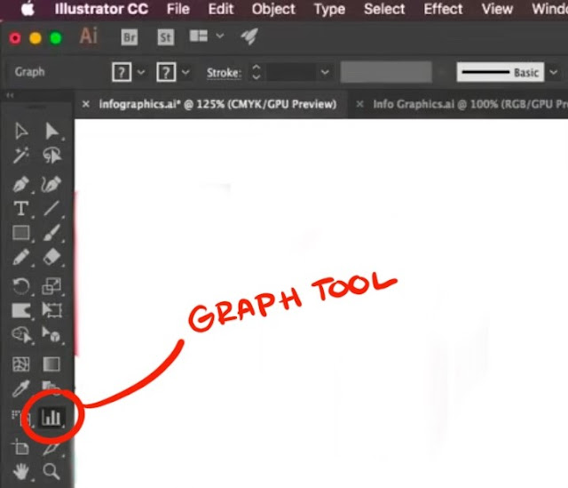
Where is the Graph Tool? 

The graph tool in Illustrator is in the right-hand column of your tool set. It may look like a small column graph if you haven't used another graph tool before. 


You can bring a palette of all of your graph tools by clicking on the tool and then clicking the side bar of the window that tool brings up. But you don't have to. It's just like any other! 


Pie Charts


Similar to the column charts, select the Pie Chart tool from the Graph Tool options. 
Then click and drag where you want the chart to be/how much room you want it to take up on your artboard. 

The little excel-data window will pop up and you can enter in your data manually. The top row is where you put what your pie chart is representing (ex. Macbooks, iPods, dogs, etc.) This will also create your Legend for the Pie Chart. 

The next row will be where your numbers go in. Remember you can import your data by clicking the icon next to your data input bar. 


You can also change the font of the words by the legend by selecting the words and going up to the font drop-down menu. 


Like shapes, each piece of the chart is like a shape (even though the whole chart is grouped together). Select the piece of the chart you want and you can then change the color. 
**You have to change the legend swatch independent of the pie piece. 


Ring Pie Chart

If you are trying to make a ring pie chart here are the steps you should follow: 

Step 1: You have to ungroup the pie chart. 
***This will make changing the data no longer possible! Do so with certainty that your data is accurate! 
-Select the whole graph
-Go to Object from the to menu
-Select "Ungroup"

**Don't hit Expand!! Even though it's a common method, don't use it for this. 


This will bring up a dialogue box letting you know about the data. Hit yes and now you're ready to move on! 


Step 2: Make a circle shape in the middle of the pie chart. 
-Get your ellipse tool and draw a circle in the middle of your chart. 

PRO TIP: Hold down Shift + Alt key to make a perfectly symmetrical circle in the middle of your pie chart.

Step 3: Select your graph again. Go to your Shape Builder tool and use it to cut out the shape by drawing a circle inside of the ellipse. 

PRO TIP: HOLD DOWN THE ALT KEY TO CUT OUT THE SHAPE!

It will cut the shape out automatically following the ellipse shape you created. 
**Avoid just putting an ellipse shape over the graph and then filling it to match the background. It's important to cut out the shape for future edits (3D, etc.) 


3D Pie-Chart

Your pie chart doesn't need a ring in it to become 3D but we are going to continue using the example above for this next tutorial on how to make your chart 3D. 

Step 1: REGROUP your graph. 
-Select it
-Use the hotkey marked in the image below. Or use the drop-down menu. 


Step 2: Make your 3D Shape
-Go up to Effect from the drop-down menu up at the top of your screen
-Go down to 3D
-Click "Extrude and Bevel"


Your shape is now 3D and you can mess around with the direction and the light-source with the cube in the window that just popped up. 

If you want to do more with your light-source then click the "More Options" Button at the bottom of the window. It'll bring up a sphere with a light source. You can also change the ambient lighting, the intensity and the shading color in the drop down menus next to the light source sphere. 

You can also change the shadow plane of the new 3D object by changing it on the "Shade Color" Drop-down menu. It can be "None" "Black" or "Custom" where you choose the color you want the shadow plane to be. 

**Make sure to check your colors that they fit with the new light-source of the graph. (You want to be able to see the planes) 

**Make sure your "preview" box is check on so you can see your shape change in real-time. 


Moving Pieces of your Pie Chart

If you want to move pieces of your pie chart then turn off the 3D effect on your graph (do this by clicking the visibility marker or the eye next to the layer that says "3D". This will make your graph appear flat again. 

Then take the individual pieces you want to move and move them. 

Now turn your 3D effect back on and voila! Your pie chart looks even cooler! 


You now know how to make a pie chart! 


How to Make Graphs in Adobe Illustrator Part 1: Column Graphs

Hey IS Artists! 

Here is a tutorial on how to make graphs in Illustrator just by inputting data. It'll save you tons of time not having to create point by point vector pie-charts, column graphs, etc. 


Where is the Graph Tool? 

The graph tool in Illustrator is in the right-hand column of your tool set. It may look like a small column graph if you haven't used another graph tool before. 


You can bring a palette of all of your graph tools by clicking on the tool and then clicking the side bar of the window that tool brings up. But you don't have to. It's just like any other! 


Column Graphs

Here is a tutorial of how to make a column graph by entering in data. 

Step 1: 
Select the column tool from your graph tool set. Now click and drag onto your artboard where you want the column to be. 

Step 2: 
Once you have a graph up a small "excel-like" window will automatically pop up. Here is where you can manually enter in the data. 


Enter in your data into the first row of the chart. The graph will automatically change as you put in the numbers. There! You're done making a graph! Simple right? 

Comparison Column Graphs

To make a comparison chart simply just plug the second set of data into the second row of the chart. The chart will then appear on the right of your original chart. 


If you need to IMPORT your data, click on the icon that is directly next to where you enter in your numbers. 
**Make sure you data is in the right file format (.txt, etc.) 


  • If you accidentally enter graph data backward (that is, in rows instead of columns, or vice versa), click the Transpose button () to switch the columns and rows of data.

Adding Color

Now, if you want to give your chart some flare, just treat it like a normal shape! Each box is going to act like an individual shape. Use your select or Direct Select tool to highlight one of the columns and simply use a swatch to change the color. 
**Changing a color on one graph will not change the color in the other graph! 

You can also remove or edit the outline of the columns as well. 


Changing Fonts

You can also change the font of the numbers beside your chart. Select the numbers and change the font to what you want up at the top. 


If you want to add more flare you can add effects like you would to any shape like Graphic Styles which can be found on the right of your workshop. Choose an effect and apply it to one or all of your shapes. 


If you want to change the colors of the other Graphic Styled shapes, click the "Recolor" button at the top of your screen. This will bring up a window with all of the levels of your colors on your graph. Hit the "Edit" Button and a color disc will appear. 
CLICK THE LINK BUTTON at the bottom right of the color disc and then you can change the colors by clicking and dragging the arm on the disc. Do this for each individual column. 


If you need to change some data, don't worry, you don't have to start over. Simply right click the chart and select "Data". BOOM! You now have your excel box back and you can change any of the data below. Your graph will automatically adjust even if the numbers are higher than they originally were. Your graph will compensate. Your colors and font will stay the same as well!


That's how you make a Column Graph!